Bethrh Butter
A warmer digital shelf.
Storefront interface & imagery
THE PROJECT
Visit websiteBethrh is an Omani nut butter brand with a storefront spanning butters, granola and hot chocolate. The captured storefront combines right-hand category navigation with bilingual product cards, visible size choices and warm cream-and-sage tones. Alongside the public interface, ingredient close-ups and existing packaging show the wider visual language of the collection.
IN THE DETAILS
Let the ingredients lead
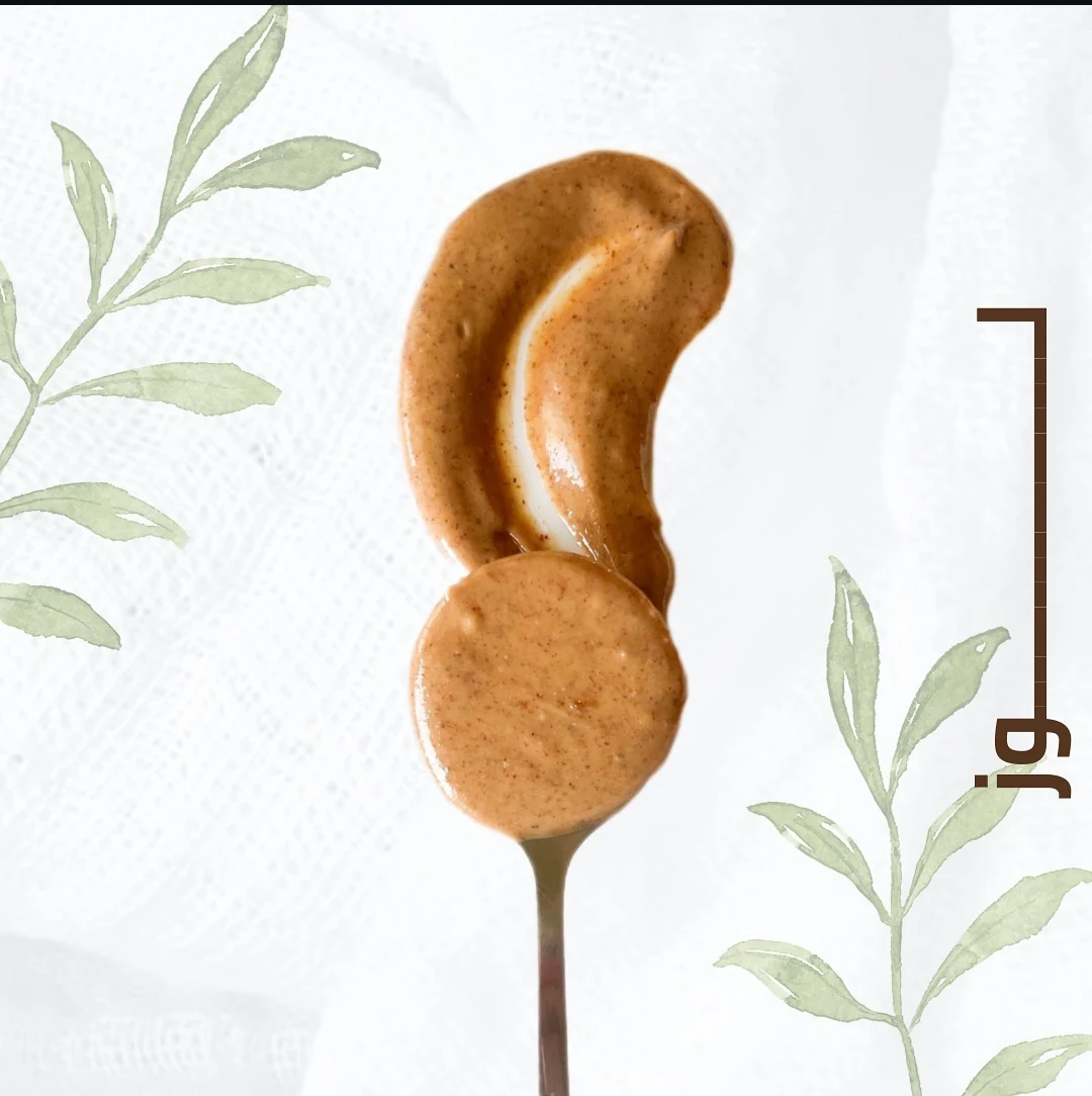
Close-up textures and simple compositions make the products the focal point. Botanical drawings frame the imagery without competing with it.
A clear shopping sequence
In the captured desktop view, category navigation stays apart from the product grid. Each card follows the same visible sequence: a generous product image, Arabic and English names, size choices, a price and an Add action.
A bilingual identity
Arabic and English are part of the product presentation rather than an afterthought, with the established packaging providing a clear point of reference.
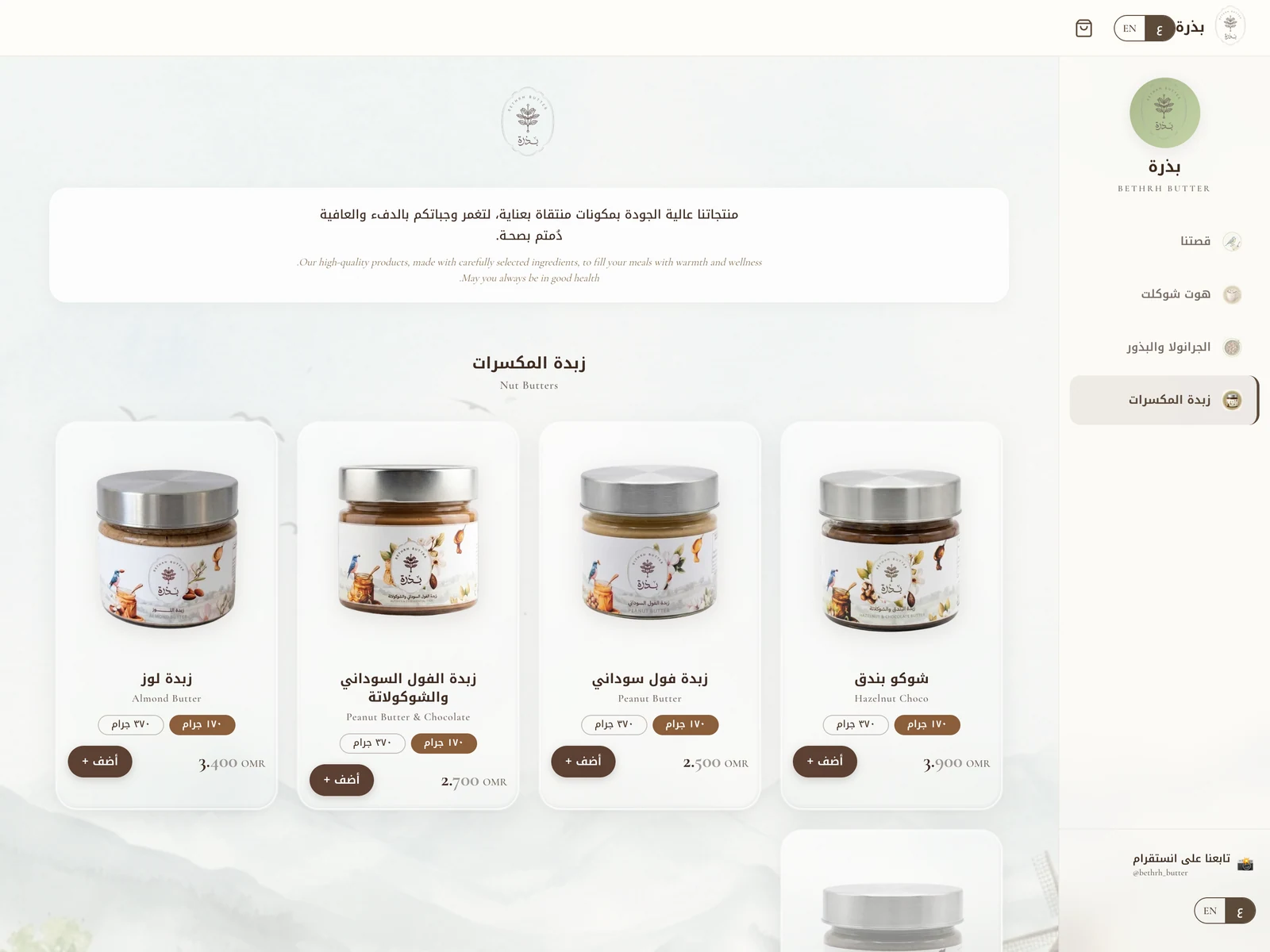
Public storefront captured at bethrh-production.up.railway.app on 10 October 2026. Products and prices reflect the visible page at capture, not a promise of current availability.
Ingredient-led imagery from the storefront asset collection.
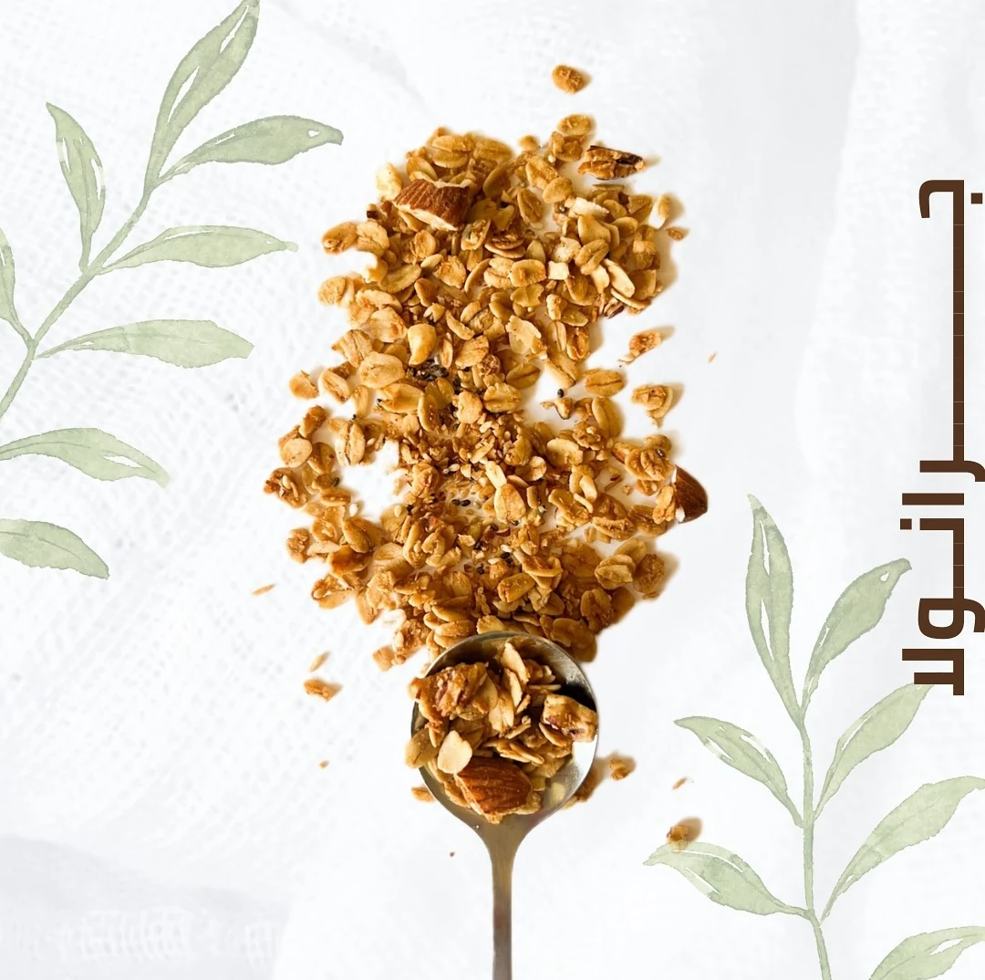
A consistent composition across different product families.
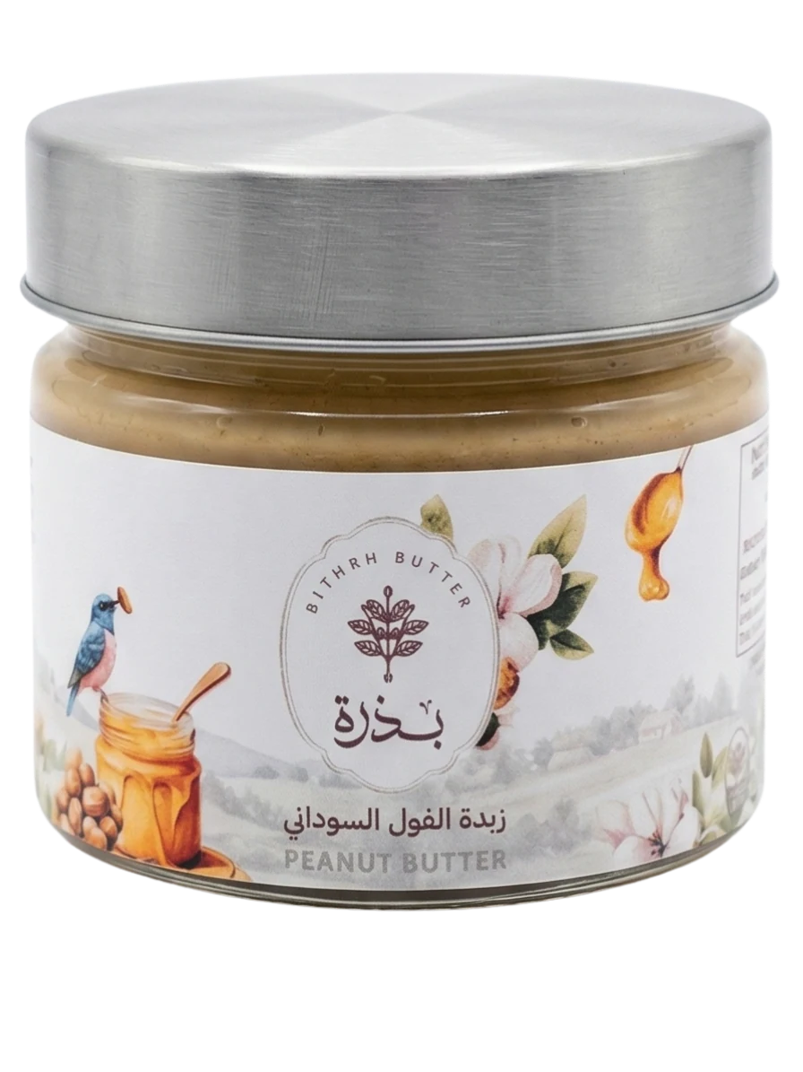
Existing product packaging, shown as brand context.
Have something in mind?
Let’s talk about the identity or digital experience you want to create.